
HTML5 game publishing
Better Titles and Thumbnails for HTML5 Games
How to show the playable action at small sizes, write a specific title, and test discovery assets without misleading players.

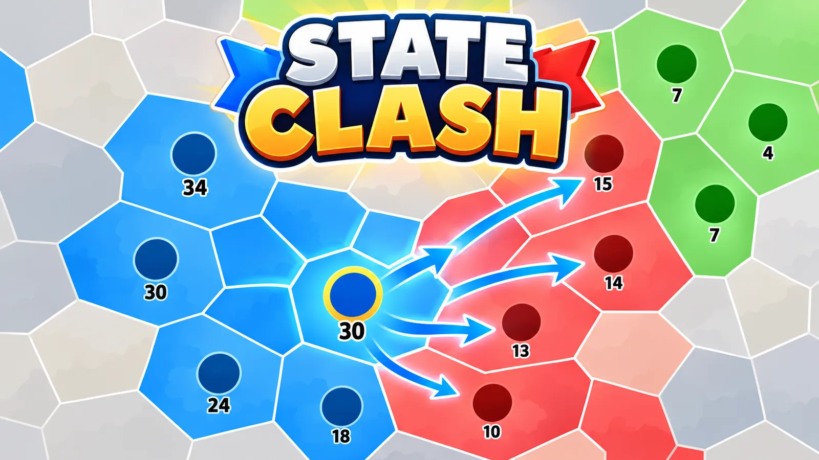
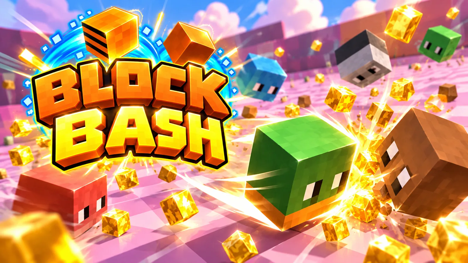
A portal accepting your game gets it into the catalog. It does nothing to make a player click it over the twenty other thumbnails on the same grid. That decision happens in well under a second, based almost entirely on two things: the thumbnail and the title. Everything else about the game — how fun it is, how well it's built — only matters once someone's clicked through.
What a thumbnail has to do in half a second
A player scanning a grid isn't reading, they're pattern-matching — shape, color, and a recognizable subject register before any text does. A thumbnail needs to communicate genre and mood almost instantly: is this fast or slow, cute or intense, competitive or relaxing. Get that read wrong and you'll pull in the wrong audience, who'll bounce fast and drag down every retention metric a portal cares about.
The concrete things that move click-through
- Show the core action, not a menu screen or a logo. A thumbnail of gameplay — a car mid-drift, a character mid-jump — communicates more in an instant than any amount of stylized branding.
- Use high contrast and a clear focal point. A cluttered thumbnail with ten small details competing for attention loses to one bold subject on a clean background, especially at small grid sizes.
- Avoid dense text baked into the image. Most players won't read it at thumbnail size, and it's one more thing to update if you ever adjust the game's name or branding.
- Match the thumbnail's energy to the actual game. A high-action thumbnail on a slow, relaxing game gets clicks that immediately bounce — technically a click, but not one that helps your retention numbers.
- Test bold color against the portal's own background and UI. A thumbnail that blends into the page's default palette gets scrolled past without registering at all.
Titles: specific beats clever, almost every time
A title's job is to answer "what is this" as fast as possible, not to be memorable on its own. "Zombie Siege" tells a player exactly what they're getting; a wordplay title that doesn't reference the genre or hook makes them do the work of figuring out whether it's worth a click. Genre-plus-hook ("Rally Race Pro", "Cozy Bakehouse") reliably outperforms purely evocative naming for a game nobody's heard of yet.
A/B thinking without actual A/B testing
Most solo developers and small teams don't have the traffic volume to run a statistically meaningful thumbnail test. What you can do instead: make two or three real candidate thumbnails before you ever submit, show them to a handful of people cold with no context, and ask what they think the game is and whether they'd click it. That single round of outside feedback catches obvious misreads — a thumbnail you know is action but a stranger reads as horror — far more reliably than judging your own thumbnail after staring at your own game for weeks.
Don't neglect the description that sits right below it
On portals where a short description shows near the thumbnail, it's doing secondary work the same way the title does — confirming what the thumbnail promised, not repeating it. A single clear sentence about what the player does beats a vague marketing line every time; "Merge matching bakery items to build the tallest cake tower" tells a player more in eight words than "the sweetest game you'll ever play" does in twelve.
On PlayKovo, thumbnail and cover image specs are listed in the submission rules — worth checking before you export, since a thumbnail that gets cropped or scaled unexpectedly on submission undoes all of this.